A craze for pastel wall paints is gripping fancy households — but they are not the saccharine tones common of baby nurseries.
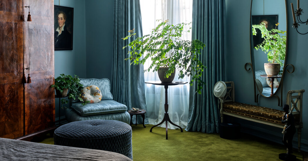
Here enters the dirty pastel palette: a spectrum that includes dusty rose, mucky light green, grimy ice blue and oxidized lilac tones. The colors, which can look like a pastel that has taken a too-large dose of colloidal silver, are often mixed with dabs of gray, black or ocher and are prized for casting a moody, enveloping effect.
Tastemakers from the self-care and fashion worlds are opting to live in pastel-frosted homes. The colors have even made appearances outside domestic life: They were favorite backdrops for exhibitors at the European Fine Art Foundation fair in New York City in May; last month, the Brooklyn apartment of Tony Liu, co-founder of the fashion industry Instagram account Diet Prada, went viral for its decadent design and allover pastel use; and models slinked down Prada’s runway show during Milan Fashion Week against a wall that reflected somber pinks and blues.
Their growing popularity could signal a tiptoe toward more colorful living spaces after taupes, grays and whites drove the look of American households for at least a decade.
“They feel a lot more adult and elegant,” said Leanne Kilroy, an American interior designer in London who also writes a Substack newsletter about home decorating. She likened the colors to a new neutral, particularly when painted across the majority of rooms and hallways in a single residence.
The designer Lauren Geremia — who said she used the tones liberally in recent projects in San Francisco and New York for her firm Geremia Design — added that this can make a space feel “like a vintage photograph, a little hard to place time-wise.”


