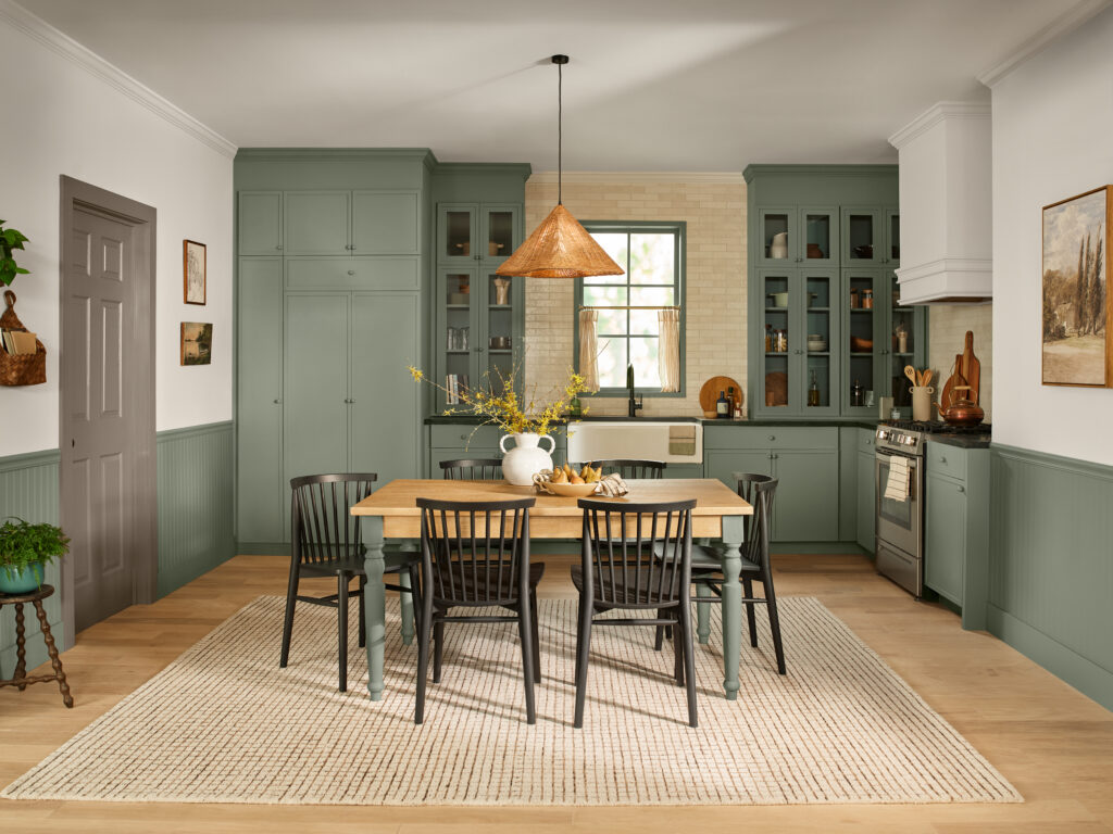
MINNEAPOLIS – Warm Eucalyptus 8004-28F is paint company Valspar‘s 2026 Color of the Year. According to the company, Warm Eucalyptus is naturally restorative and serene reflecting a collective desire for calm, grounding design that adapts to the ever-changing pace of life across residential and commercial design.

“Warm Eucalyptus is more than just a beautiful shade of green, it’s a reflection of the comfort we crave in our homes,” said Sue Kim, director of color marketing at Valspar. “Its warm undertones create a grounded, welcoming mood while drawing inspiration from nature and the familiarity of retro design. This is a color that encourages restoration and resilience.”
According to Valspar, consumers are signaling a desire for nostalgic joy and comfort. Warm Eucalyptus meets this moment, channeling vintage palettes and playful color-blocking techniques that evoke emotion and optimism.
Renters and homeowners are evolving their spaces to offer more than just living; they’re creating havens for rest and renewal, the company said. Warm Eucalyptus complements this shift, encouraging thoughtful, multifunctional design. Its soothing tone creates a sense of comfort and reassurance while providing a peaceful canvas for self-expression.
Supporting colors
Earthy, supporting colors perfectly complement Warm Eucalyptus, making it easy to create a cohesive, soothing home inside and out:
- Degas Blue 8004-35B: A breezy light blue warmed by hints of green and gray, evoking soft
nostalgia and quiet joy. - Groundbreakinq 8005-8F: A cozy deep brown with gray undertones, inspired by natural
materials and the understated luxury of earth tones.
The Valspar color of the year is also known as Sage Slate V143-5 at independent retailers nationwide while it the color is called Warm Eucalyptus at Lowes stores nationwide.
“Sage Slate V143-5 is naturally restorative and serene, bringing comfort through its combination of retro inspiration and ties to nature,” Kim told Home Accents Today. “It is a nostalgic hue, which serves as a coping mechanism to stress and offers emotional grounding through design. This color choice supports interior trends, which continue to support wellness and mindful living inspired by a need to create a restorative feeling at home.”
Kim added that designers can create that sense of restoration through designs that connect with nature and applications of natural materials and shapes in clients’ spaces.
“The hue plays into a larger interior design trend we can expect to see in the coming years, where there’s a focus on artisans and craftsmanship, connecting vintage pieces with retro-futurist aesthetics,” she added.


