At a Glance:
- Leatrice Eiseman revealed the Pantone View Home + Interiors 2027 forecast at The Inspired Home Show 2026 in Chicago.
- The forecast includes seven color palettes emphasizing calm, comfort, and sensory integration for home design.
- Cloud Dancer, Pantone’s 2026 Color of the Year, reflects a desire for peace and clarity in a noisy world.
The most directional color and design trends for the home feature the calm, comfort and joy consumers are seeking, renowned color expert Leatrice (Lee) Eiseman told attendees at The Inspired Home Show 2026. In her annual keynote address, Eiseman discussed the influences on color trends and revealed the seven palettes in the Pantone View Home + Interiors 2027 forecast.
Eiseman is a renowned color specialist with roles as both executive director of the Pantone Color Institute and director of the Eiseman Center for Color Information and Training.
Color Trend Influences for 2027
Eiseman’s keynote, which focused on the theme of “Sense-Abilities,” addressed the need for sensory integration and unexpected color applications that consumers can incorporate in their homes. The goal, she said, is to offer ways to help them create a respite from the outside world, which many feel is getting increasingly noisy and overwhelming.
Eiseman told the packed audience that fashion, film and technology are key influences on future color trends for the home, along with nature and culture. “There are emotional and psychological aspects of color,” she said. “Trend has reason behind it.”
The idea behind “Sense-ability,” Eiseman explained, is that when people use their senses – smell, touch, taste, vision and hearing – they can tap into their emotions to create holistic and more meaningful interactions. Because physical appearance and color are top considerations when someone buys a product, a multi-sensory experience also helps capture their attention.
This multi-sensory approach translates into 2027 color trends, which include the calming hues of nature, nostalgia for the past, and joyful or dramatic colors found in popular culture.
Cloud Dancer, Pantone’s 2026 Color of the Year, was also selected to reflect a growing desire for quiet. The versatile white that balances warm and cool tones offers “a hushed whisper in a noisy world and a desire for peace and for clarity,” she said.
Eiseman believes the color is a necessary hue that provides comfort, in addition to being a classic that never goes out of style. She said white has become a seasonless color, as seen in quilted applications for home and personal accessories that span the seasons.
“When used in the home, white is considered a staple – a dependable choice – and when used in clothing, it’s an inevitable classic,” Eiseman explained. “A conscious statement of simplification, Cloud Dancer enhances our focus, providing release from the distraction of external influences.”
Seven Color Palettes for 2027
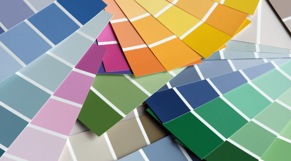
Eiseman closed her session by revealing the seven color palettes in the Pantone View Home + Interiors 2027 forecast. The palettes are:
- Delight—This palette represents summer at its softest – celebrating life’s simple pleasures and sensory joys with the muted tones of a summer meadow.
- Allure—Inspired by glamorous Hollywood films, Allure features a combination of hues that are dramatic and elegant.
- Lucid—Blues and greens dominate the Lucid palette, which is intended to represent the “quiet magic of cool imagination and daydreams with clarity and transparency.”
- Hush—This palette is felt before it’s noticed, said Eiseman. It features quiet light and muted midtones that represent health, wellness and calm.
- Honest—Honest features warm and comforting hues – browns, reds and oranges – that are reminiscent of comfort foods and homemade baked goods. “This palette goes well with mauve,” said Eiseman.
- Grounded—Drawing inspiration from nature, this palette has organic shadings and varietal earth tones. It mixes well with many household items people already own, Eiseman said.
- Elation—Elation features eclectic and contrasting hues, making for a vibrant and playful palette.
d


